Good news, everyone! Enjoyed from SMEs and startups up to Fortune 500, Weekdone has been one of the forerunners in OKR software solutions. Based on customer input we’re now happy to announce some nice improvements to our belowed OKR features design.
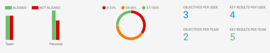
First, we added three new OKR dashboard graphs. Weekdone is all about quick actionable metrics towards tour teams and people. These represent that goal. You can now see at a glance:
- OKR alignment via linking: how many team or personal OKRs are linked or not linked to higher level company or team objectives. The big goal of OKRs is always for people and teams to work towards the top company goals. Hierarchical linking of OKRs is the cornerstone of any OKR solution, including Weekdone. The alignment graph should help all leaders to drive more OKRs to be linked to higher levels.
- OKR distribution by progress stage: how many OKRs are 0-33%, 34-66% or 67-100% done. As the goal is always to move towards green done progress, this is a great way to see how far your teams, people and whole company are. While 67% does mean an OKR being done yet, it is a good measure of showing it as in good state.
- Average Objectives and Key Results per person and per team. Best practice here is for 2-3 objectives per person or team, each with 2-4 key results.
Second, the main OKRs view got an upgrade. As we have more and more large users, our main OKR view showing all objectives, key results and progress graphs became too long and slow. There was no way to show hundreds or even thousands of people on one page in that format.
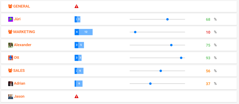
The new OKRs view has teams and people closed by default, being more app-like. This gives a nice table of contents to all your teams and people, showing progress for each. But no worries: just one click on the name opens the familiar details view.
There are also new blue labels showing how many Objectives or Key Results everyone has. A red triangle means no OKRs have been set.
You can also choose a team or person from left sidebar to drill into full view for that OKR selection. Feel free to also use the open in new tab or window in your browser to open them in an additional view.
For sure we will be adding more OKR graphs to our OKR dashboard in the future – stay tuned. Feel free to suggest your own.
What would you like to see on our OKRs side next? Comment or e-mail us at hello@weekdone.com.