As managers we are all short of time. Think if you could save time on managing your team, while quickly focusing on what’s important. What if you had something in your pocket that quickly showed your team progress updates on a nice dashboard. More than that, what if it told you who you should focus on? Or which goals need more attention than others?
You asked for it. With Weekdone you can.
Weekdone has dashboards in both areas – Weekly Check-ins and Quarterly Objectives. Weekly Check-ins dashboards help you to understand how your individual team members have been doing, and Quarterly Objectives dashboards will help you to understand how much progress your team is making on your Objectives.
Quarterly Objectives dashboards
Under the Quarterly Objective tab on the left, you can find this dashboard. It will help you quickly see how your team is generally doing. On the left where the teams are listed, choose your team to generate the dashboard. If you want to know how other teams are doing then keep in mind that Weekdone is transparent! That means you can see each team’s OKR data and their dashboard.
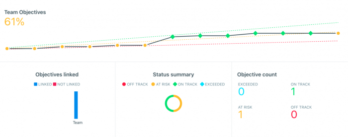
The “Team Objectives” percent reflects the average completion percentage of all of your set Objectives. The three stripes and colorful dots timeline shows how the goals have been doing week by week. Each week you are expected to reach a certain % of progress if you want to achieve your Objective. The color codes easily help you evaluate how you are doing. If you hover over the dots on the timeline, you can see the expected progress by a certain timeframe.
The colors are shown based on this logic:
- Red means your Objective is off-track. You have achieved less than 33% of the expected progress.
- Orange means your Objective is at risk. You have achieved 33%-66% of expected progress.
- Green means your Objective is on-track. You have achieved 66%-100% of expected progress.
- Blue means you have exceeded your Objective. You have achieved more than 100% of expected progress.
If we look at our example, we can see that the team progress is at risk (orange) with 61% of the Objective completed. The timeline with the colored dots shows that the team has been at risk, on track, and at the end again at risk with the progress of their Objectives.
One goal is on track and one is at risk. Here you can easily see the goals at risk that need more attention than others!
View these goals by scrolling down to the listed Objectives. You will see the at-risk goals in yellow along with the percentage achieved (54%):
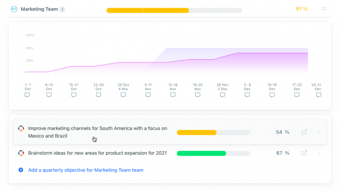
Click on Team Timeline to see more detailed information of the progress of each Objective week-by-week. Hover over any of the added Objectives to highlight its line on the timeline. This way you can see if the team has been progressing step-by-step with the Objective or if it has had some remarkable jumps during certain weeks.
Looking at the progress over time helps to see if there are any patterns or connections between OKR’s success and things happening in the company. It also shows if people started to work on the goals immediately or if progress has stalled for a few weeks.
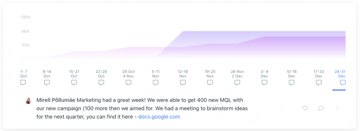
Tip! While you are reviewing the progress of your goals and coming to some conclusions, you can add them directly to your Team Weekly Summary by clicking on “this week” in the timeline. This way you have more detailed information to refer to in the future. Weeks that have these weekly summaries will show up as filled conversation boxes. Click on them to see the summary of that particular week.
Weekly Check-in dashboards
Our Weekly Check-in dashboards help you understand in seconds who in your team needs more attention and who deserves a pat on the back. In an instant, you see your team’s happiness, overdue plans, plans completion ratio, and problematic issues. For each person, you see their task distribution between progress, plans, and problems, as well as other data. Underneath the dashboard, you can quickly scroll to each person’s weekly report area for more details on their PPPs.
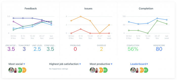
The main team dashboard will show the average job satisfaction score given over time. If you have set up other 5-star rating questions then you see the result of those as well. If the scores are low then you as a manager might want to check in on what’s happening and how you might help them. The Issues graph shows how many problems have been reported each week and how many overdue items to team members have.
Issues scores you want to keep low. If you see many reported problems, make sure you check in if there’s something to solve on your side.
Completion shows what percentage of the added items were completed during the week. The more the merrier!
In the Completion graph, you will also see the Weekscore. Weekscore starts at 50 and can go down to 0 and up to 100.
To calculate the Weekscore for the team, we use:
- weekly job satisfaction score,
- weekly task completion,
- weekly overdue tasks, and
- number of weekly tasks as components.
The first two are positive and the second two are negative. The more problems you have, the lower the score. The more completed tasks you have, the higher the score.
Let’s scroll down to see the individual stats of each team member.
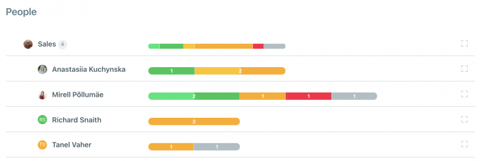
Looks nice and colorful! The colors actually help you to quickly see how each person is doing.
Green, means completed items.
Oranges represent overdue plans (not completed during the week or by the due date set).
Red shows how many problems people have reported.
And grey represents how many items were added to other customized categories if there are any.
The more green and the less orange and red, the better!
Tip! As a recommendation, you don’t want to see many overdue items. If a person has over 10 items sitting there then there might be some prioritization issues or many things left undone. If a person doesn’t have any stats or you aren’t seeing stats for your team, you most likely aren’t doing weekly check-in meetings. Weekly Check-ins are done together as a team and help everyone prioritize their plans to help move your goals forward. Read more about how to run effective weekly check-ins here. Only then you can see and praise their efforts.
As long-term managers and entrepreneurs ourselves we fully understand no online or mobile tool replaces the human factor and face-to-face interaction. Also, no statistical analysis or numbers tell us who is doing their job well and who isn’t.
Someone who has just 1 crucial plan that takes the whole week to execute might be a star performer. Another who plans small non-important plans and executes 10 of them each week at the same time might not contribute much to the company. Tools like Weekdone are here to be a helping hand. You as a manager must always use reason to analyze the data and take action when needed. Still a dashboard like this can give you a head-start and save quite a lot of your time.
Good leadership is always a two-way street. The biggest problem employees bring out is not having enough feedback. Use Weekdone to give weekly feedback, suggestions and ask questions – that’s what makes it valuable to your people.
Give it a go at Weekdone and try it out yourself with your team now. For teams of 3 or less, Weekdone is completely free. If you have more than 3 in your team or company, you can get a 14-day trial.
If you’re a new user, remember to invite your team and get their progress data, only then you’ll be rewarded with a nice dashboard like this. No data – no fun.