Our product and design teams have been hard at work to make Weekdone even better for you. This is an overview of all the new features and improvements launched recently.
While many of the additions are useful for everyone using Weekdone, one special focus has been our larger users. It’s to help Weekdone scale from a few hundred employee to 1000+ user installations, supporting many of our users up to Fortune 500. Many other additions were made to make the Objectives and Key Results part smoother and useful for you.
Departments – new grouping layer above teams
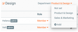
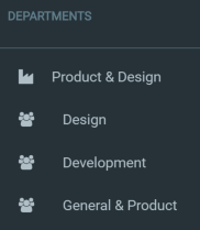
There is now also a fourth level of OKRs available – Department OKRs – which you can turn on at the OKR Settings page as an admin. It’s a level in between Company and Team OKRs. It’s great for linking all your company goals as one tree-like hierarchy.
Linking weekly items to OKRs
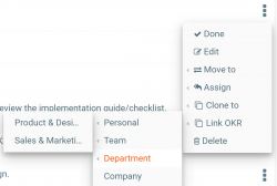
Under each Objective text the first small icon on the left with square and arrow opens Objective’s details view, which will have linked weekly items at the bottom.
Custom filtered OKR reports
Many of you have asked to see just some items and not others in a report. Now you can, starting from the OKR report.
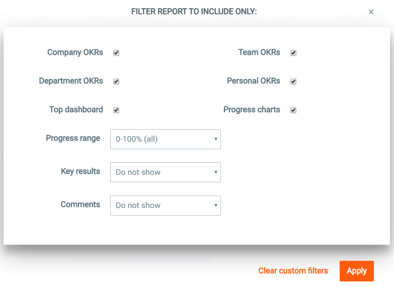
In the OKRs tab next to PDF download icon in the header you now find a custom report filtering icon. Click it to open the filtering window:
By selecting the options you can filter the OKR report to show just some selected sections of it. You can also set conditions:
- Show objectives in a certain pogress % range. It’s a good way to find 0-33% OKRs which are not moving forward and still red.
- Show key results based on their last update time. See which goals are not showing any progress in last few weeks.
- Show comments only from a certain time, allowing you to see just recent updates.
Then click Apply to show the report. If you now want the same report in PDF, click the download icon in the header to download it.
Custom team reports
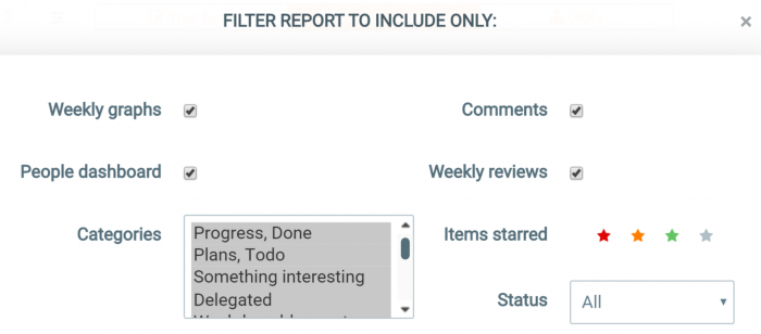
Both the team reports by users and categories now also have custom reporting from the header icon. Choose which categories, star colors, statuses, comments, weekly reviews or graphs to include.
Custom OKR quarter dates
Not all companies start their Q1 January 1st. There is now support for custom quarter start dates in Weekdone under OKR Settings. You can use either:
- Shifted quarters. They still start on 1st date of the month, but not in January. A common one is Q1 starting 1st of July. Just use the month name arrows to choose which month Q1 starts in.
- Selected weekday of a month, where each quarter starts for example on the 4th Saturday of each quarter’s first month. Click the day in Q1 to select the weekday and other quarters will adjust accordingly as well.
When changing the quarters keep in mind that old already defined OKRs and their weekly progress are kept in their named quarter and week. If you had something in January under Q1 and you now make Q1 start July 1st, the old Q1 OKRs will also move to July.
If you make changes make sure people adjust their OKRs due quarters accordingly. Luckily you should do that just once in a company lifetime.
New improved search
The search at the top got many improvements:
- You can click to tags and items results sub-pages.
- Items have timestamps.
- OKRs have level labels and quarters.
- Longer lists are scrollable.
Copy to Clipboard command
Did you know pressing Shift+E opens a batch item actions menu? Select items from the checkboxes in front of them. Then click Copy to Clipboard. You can then paste that copied list to any program on your computer by the usual Paste command.
Refreshed mobile and tablet apps
Both Android and iOS mobile apps got new versions. Most important is the support for departments. Tags sidebar support got some fixes. Google login was also migrated to a new version.
Make sure to update your mobile and tablet apps or download them if you have not done so yet.
Design improvements
There have been also many user interface improvements to make your work easier:
- When liking items, the large emoji windows got replaced with a mini-popover. You still can open the full emoticon selection from the icon at the end of items or comments.
- Allow Clone To action to single persons.
- Custom 5-point ratings are shown in weekly report e-mails.
- Daily Buzz e-mails and weekly reminders have a personal OKRs section.
- OKR hierarchy tree has a PDF report.
- OKR quarters now have arrows to page to next or previous quarter.
- OKR dashboard aligned/not aligned graphs are clickable to show sub-pages of linked or not linked OKRs.
- Icon in front of OKR shows it it’s linked or not.
- OKR linking modal window has items ordered by level first and alphabet second now, plus they have level icons for badges.
- Your Form OKR tabs keep the category you’ve chosen when switching quarters.
- You can switch back to OKRs dashboard from a button on OKR hierarchy tree page.
- Linked OKRs progress bar has a better disabled state.
- #hashtag autocomplete when showing OKRs shows the OKR due date and hierarchy label.
- Weekly reports by categories order people alpjhabetically.
- Comment and like links shown as icons, not text.
- Middle mouse click opens tag report and OKR sub-sections better in separate tabs.
That’s all, folks, for now.
What would you like to see in Weekdone next?
