Update: version 2.0 of Asana reporting dashboard was launched, read more here or try it out.
For quite some time, the users of the much loved Asana task management have asked us for one thing. It’s a weekly reporting tool to generate one-click reports out of Asana. Team leads and managers want to quickly see how each person and project is doing. Now you can.
Today we’re happy to launch a new visual Asana reporting tool by Weekdone. It’s a one-click service to get a beautiful weekly report out of your team’s Asana. All you do is connect and choose the workspace. Voilà! The report will be in front of you. A PDF gets e-mailed to you as well immediately. No tuning or configuration. Try it out at weekdone.com/asana and tell us what you think.
At Weekdone, being design-driven, we have some goals for the services we build. They must be easy to use and understand, bring instant utility, do one thing really well and look great visually. That’s what we are building with this as well. We want this to be the best Asana analytics and reporting service out there. One that everyone using Asana will use for their reports.
Keep in mind that today this is just a beta preview. While fully usable for production, there might be some small glitches or missing parts. Sorry if there are, just let us know.
What you’ll get
Like all Weekdone products, our Asana report dashboard follows the weekly paradigm. The report is for the last 7 days, ending today midnight GMT.
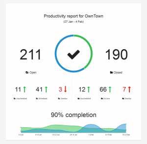
All comparisions – red arrows down and green up – are comparisons to the previous 7-day period. Click the preview above to see a larger view of the Asana dashboard.
Completion is calculated as comparison between how many open items you used to have and how many there are now. Let’s say you had 10 open tasks, closed 5: that’s 50% completion.
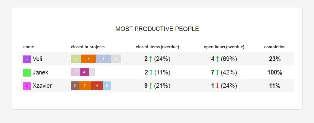
People dashboard
- number of items they have closed in each project
- total closed and open items, trend compared to last week and percentage of overdue tasks
- completion percentage for person
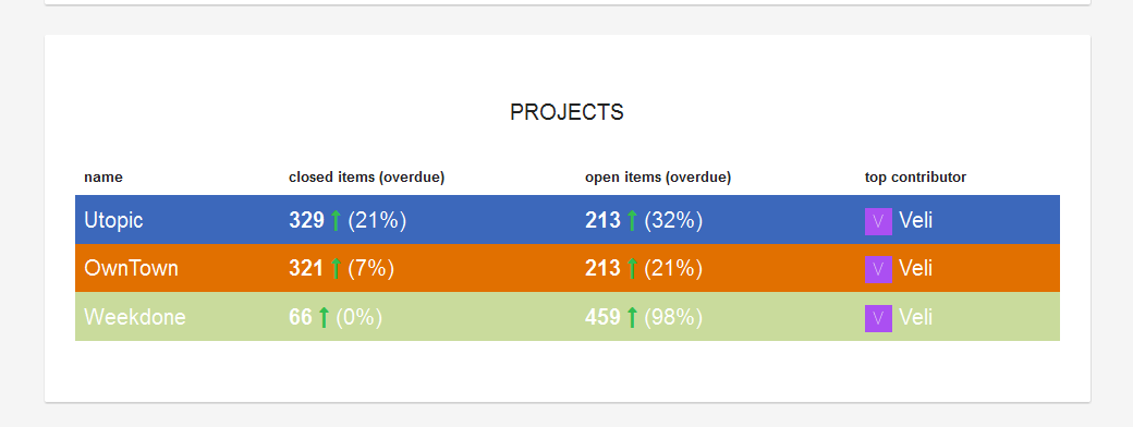
Projects dashboard
- for each project number of closed and open items, trend compared to last week and percentage of overdue tasks
- the person who has closed the most items in each projects during last 7 days
Some caveats
There are some limitations and specifics of how Asana and it’s API’s work.
One important thing to keep in mind is that if you add a task to a project, for it to be connected to a person, even yourself, you have to assign it to a person. Items under your tasks, not under a project, are automatically assigned to you right away, but not in projects.
Section headings (items ending in colon) are basically items’s just like any other in Asana. No way to differentiate them easily, so they also count under open items.
If someone creates a private project and you can’t see it in Asana, you can’t calculate it here either.
We would really like to also build a tags dashboard, but to do that we would need to import each task via a separate call and that would run into API limits right away. Let me know if you think of some cool hacks to overcome this.
What the future brings?
Some ideas not available yet are:
- date range selection
- showing the separate task headings
- separate person and project sub-pages
- tags statistics
- mobile apps for iPhone, iPad and Android
- making the Asana reporting available inside Weekdone


