As long as I have been working as the marketing manager at Weekdone, I have been studying semiotics. If you are unfamiliar with the term, semiotics is the study of signs and meaning. Semiotics is concerned with everything; from language and culture to perception and biology. Many semioticians also specialize in UX and design to create more intuitive user experiences through their understanding of our ingrained and cognitive processes.
I have just finished my PhD in semiotics and cultural studies (humble brag), and felt it was the perfect time to show you how we’ve managed to incorporate semiotic thinking with a series on applying semiotics in all aspects of your business. We will kick the series off by looking how to incorporate semiotics into your design and UX processes and give you examples and models that you can use in your own software and landings.
If you are already a semiotician feel free to jump ahead to the practical bits. Otherwise I encourage you to give your brain a workout and learn some of the basics of semiotics. Here is a quick rundown of what this article will go over:
Why Semiotics in Business?
Semiotic studies and methodologies have tons of applications in business. In general, semiotics challenges you to reassess what you are currently doing at a fundamental level. By thinking about the entire process of perception and meaning-making you can better predict and drive desired outcomes. You can also make language, processes, and interfaces more intuitive and culturally sensitive for your audience or team.
Semiotics can be applied in:
- Advertising and Design
- Branding and Marketing
- Copywriting and Microcopy
- UX and UI
- Leadership and Management
- Company Culture and HR
- Anything involving meaning making and communication (so basically everything)
Semiotics for Beginners: A Crash Course in Signs and Meaning
The history and approaches to semiotics as a field are quite vast. I could ramble about for ages and still only scratch the surface. But in order to get your brain primed for semiotics and thinking about how to apply it in your business, I want to provide an overview of the field and introduce you to some of the fundamental concepts and thinkers you should know about.
What is semiotics?
As mentioned above, semiotics is the study of signs and sign behavior. A sign is defined as anything that communicates a meaning. You can think of words as signs, for example, to communicate the meaning of the word. Or a stop sign, which communicates the meaning for you to stop your car.
But signs are not just linguistic, they can be visual, acoustic, tactile, or anything else that can be perceived by the senses. For example when we talk about symptoms of a disease, such as a runny nose, cough, loss of taste and smell those are all signs allowing doctors to identify it. When we think about software, a notification icon is a sign which means that you have some sort of update to view.
The study of signs goes as far back as Plato and Aristotle who were both interested in the relationship between signs and the world. Today the field of semiotics has numerous sub-fields that span across different disciplines and practices. Here are a few you might be interested in:
Visual semiotics: studies the way visual images communicate messages and how people respond to them. Visual semiotics covers everything from fine art to advertisements.
Cognitive semiotics: studies meaning making and cognition as related to the human mind. This field combines traditional semiotics, with cognitive science and psychology to explore the human meaning making process. This field has many applications in UX and UI.
Cultural and Social Semiotics: explores human symbolic activity and meaning-making at the cultural level. This field is especially relevant from branding and customer research.
Marketing Semiotics: takes from all the sub-fields mentioned above. Marketing semiotics is a human-centered approach to communication and media. This field is also interested in branding, customer research, and the creation of advertisements and media.
Biosemiotics: studies pre-linguistic meaning making and our subconscious behaviors and responses. Biosemiotics can be used for the study of aesthetics in design and advertisement as well as help explain consumer responses and behaviors.
These are just a few of the subfields that exist and there is plenty more to explore! I specifically studied cultural and biosemiotics, so there will be some great examples in the following sections on how I incorporated them into your product and landings.
Semiotic Terminology: Why icons aren’t just icons
Now that you have some ideas about what semiotics is all about, it is time to learn some terminology! Semiotic terminology can be a bit tricky as often we distinguish concepts you may have grouped together into one concept in your mind before. But already knowing the differences can give you some new perspective on the world.
Sign Classifications:
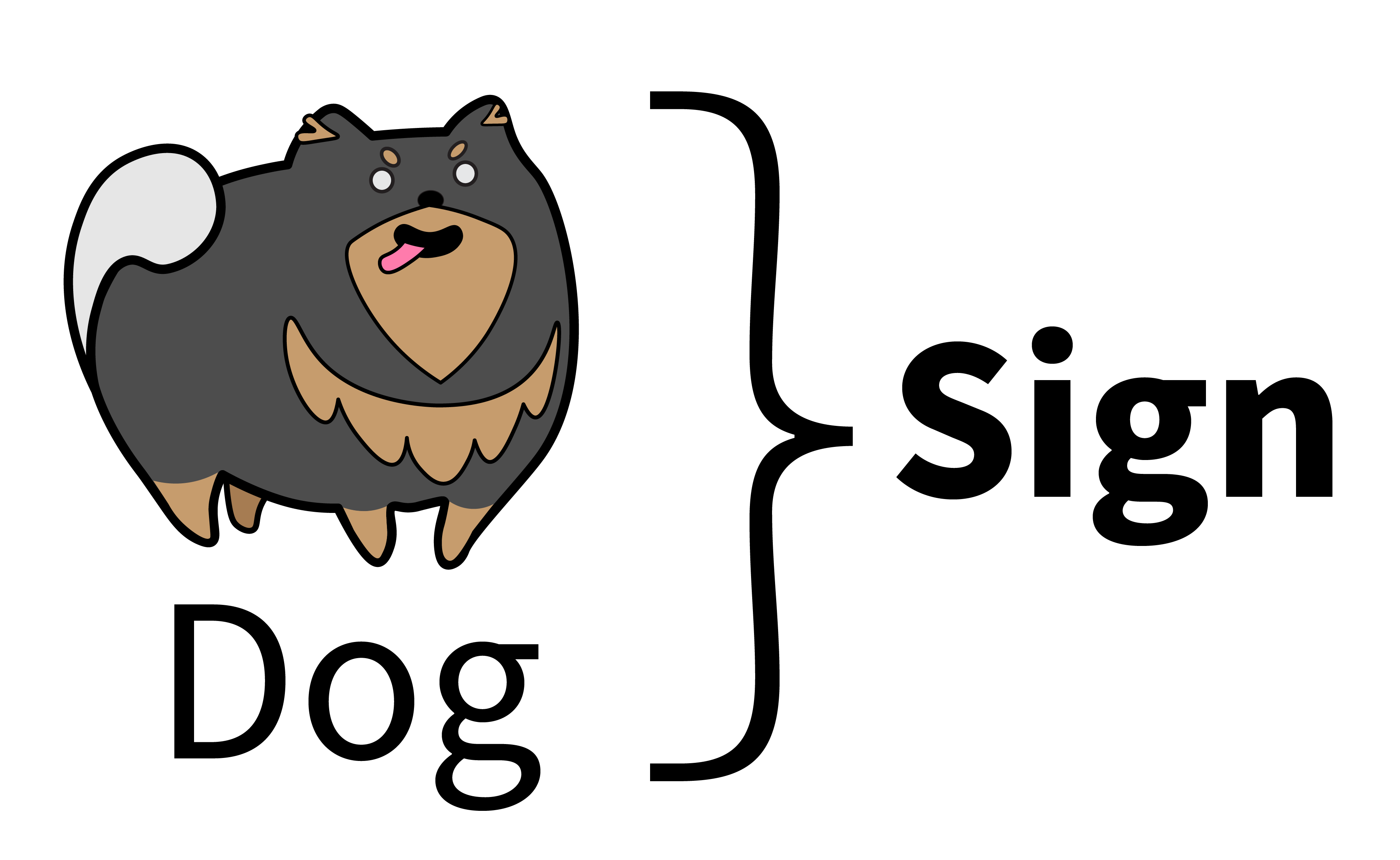
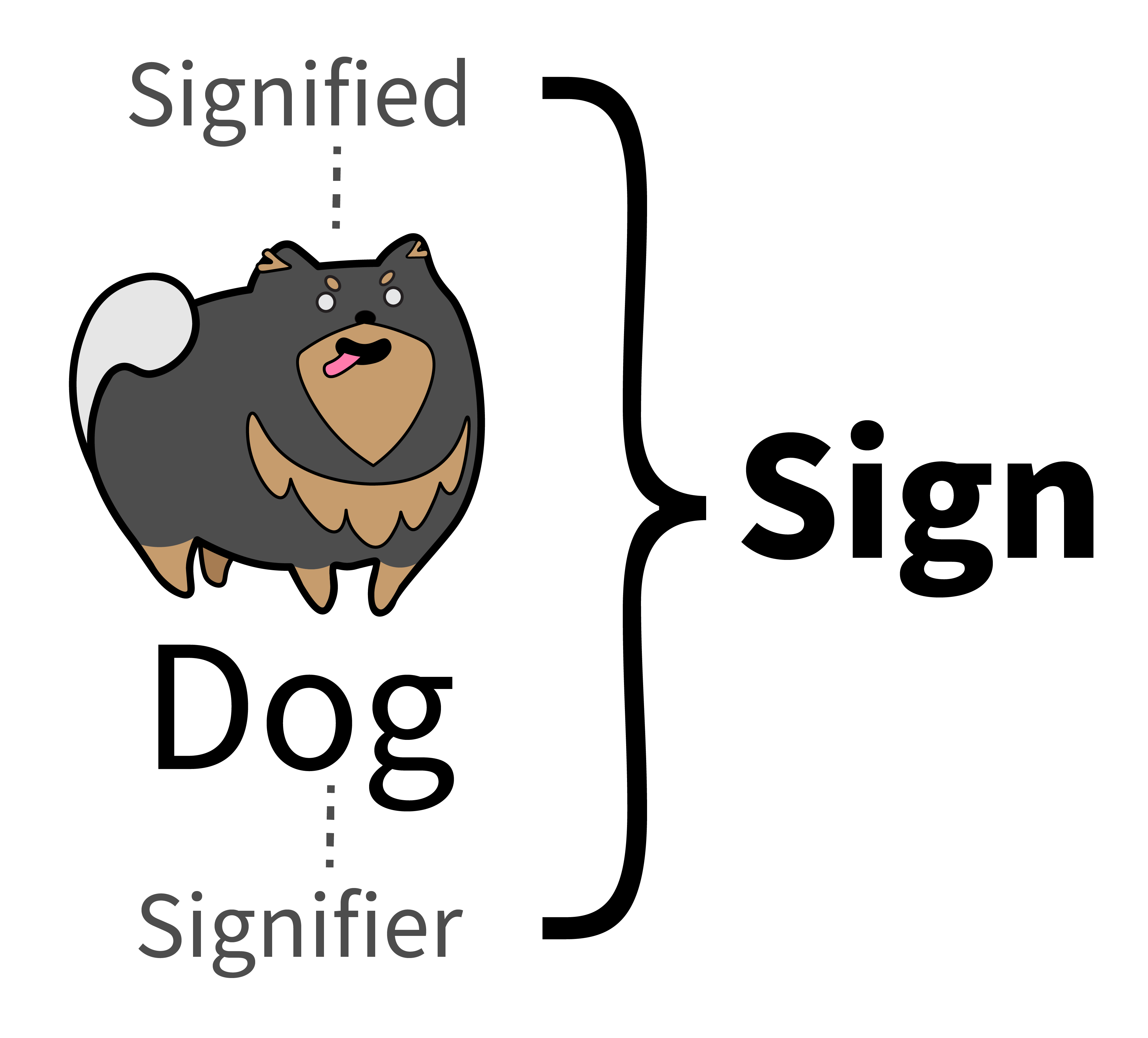
So far we went over the idea of sign, which is anything that communicates a meaning to someone. We can call this process of meaning-making: Signification.
In this process of “signification” there are two important things:
1. the signifier, a property conveys a meaning
2. the signified, the conveyed meaning.
For example: a notification alert. The signifier could be a red exclamation icon❗️while the signified is the new information.
It seems simple enough, but we can go even deeper and classify the type of sign being used. This is important as different types of signs carry different types of meanings. There are three basic types: icon, index, and symbol.
Icon: a type of sign that resembles what it stands for. For example a photo is an example of an icon, as it resembles what it is meant to represent. Many early software “icons” were originally iconic as well. One is the “save icon” which originally was an icon of a floppy disk, though nowadays the function of the “save icon” is less icon and more symbolic as it now represents the saving of a digital file rather than a floppy disk. (Many people today may have never even seen one).
Symbol: has no resemblance to what is being referenced and any relation is culturally learned. The best examples of this are written words. They represent an idea without physically resembling it. Think of the meaning of the “save icon” for younger generations, in their case a “save symbol”. Another great example of a symbol is the menu icons. They do not act as iconic representations of the menus but through continued usage they have become standard and learned.
Index: is a sensory input that relates to our points to what is being referenced. shows evidence of what’s being represented. The classic example is that smoke indicates fire. OR a web cookie is an index of your web ID. Just like icons these can become symbols over time as well.
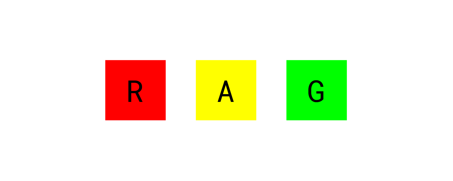
Code: In semiotics, a code is a set of conventions or sub-codes currently in use to communicate meaning. Some easy examples of code you know are spoken languages and programming codes. Or for example the RAG rating system, where red means off-track, amber means things have slowed down, and green indicates on track. Codes can be inherent, culturally learned, or a mix of the two.
These basic concepts should give you enough grounding to get the basics of any semiotic text as well as start analyzing your own materials. There are many more concepts and terminology to learn, but I will save those for self study.
Now it’s time to get to the fun part and see how we have incorporated semiotics into our work here at Weekdone and how you can practically implement semiotics in your business. After all, semiotics is concerned with everything!
Semiotics for Software UX and Design
Everyone knows that intuitive design is the best, but how do you actually create an intuitive design? And can you use cognitive semiotic theories and research to design intuitive things?
Aesthetics and perception is a deeply studied topic in Semiotics. In this section we will take a look at some semiotic theories, a little bit of my own research, and see how we applied it at Weekdone.
UX and Biosemiotics:
We have underlying biosemiotic responses to certain ques in our environment. One such, Aposematism is a biological sign process by which a given species uses various signals to convey to potential predators a sense of danger (whether there is present danger or not). Think of how poison dart frogs have vibrant colors and some caterpillars are covered in bright spikes. The opposite is cryptic coloration, or camouflage, where the aim is not to be noticed; either by hiding from predators or attacking unsuspecting prey.

When we think about this in our own world, we usually use similar bright colors and patterns to depict danger or get attention. When our eyes are drawn the black and yellow striped pattern of construction tape, or the bright red of a caution sign. This gets our attention and can even trigger a sense of danger. But this phenomena is not just relevant for road signs, it is also critically important for user inferences!
What biosemiotics means for design:
Aposematic features can be a great way to cue someone into information that is important. Think: notification icons to alert users or coloring a graph red to depict a decrease in sales metrics. But there is a flip side, these signals are stressful to the user and overloading users with bright colors and flashing patterns can lead to negative interactions with the interface.
One of my research projects offered a look at using subconscious cues in AR driven interfaces where we presented participants with a series of cues among neutral objects; one cue with the features of aposematism, and another with more positively associated features. As expected people avoided the aposematic cues, but people also avoided the more positively associated cues in favor of neutral pathways.
This clearly highlights the power of aposematism, but also hints at how the use of too many signals can stress the user, even when positive signals (such as green colors) are used.
In general, when creating an interface, it’s best to avoid stressing people with design. We are attracted to high contrast moving items and they take a lot of our attention. Bright cues and colors can be used to draw attention but too many can be distracting, stressful and hard to focus on for the user. Otherwise information is fighting for attention and we may miss out on critical information.
How Weekdone used biosemiotics:
Since, aposematic cues can both attract attention and cause stress. We chose to reduce the overall sense of stress created by our earlier interface. In Weekdone, we reduced the intensity of the colors, tried to minimize the use of reds to only critical information, and instead use neutral colors for texts and readable information.
Here you can see how we’ve improved our Weekly Report using semiotic methodologies:
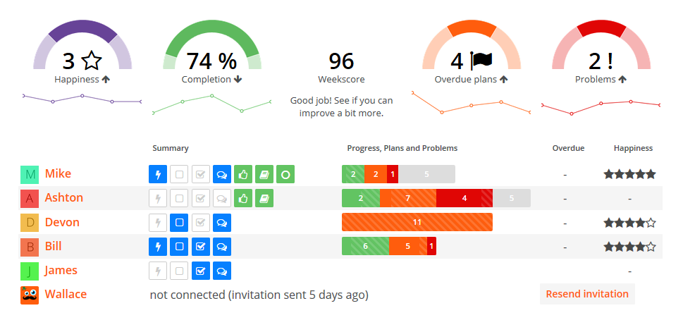
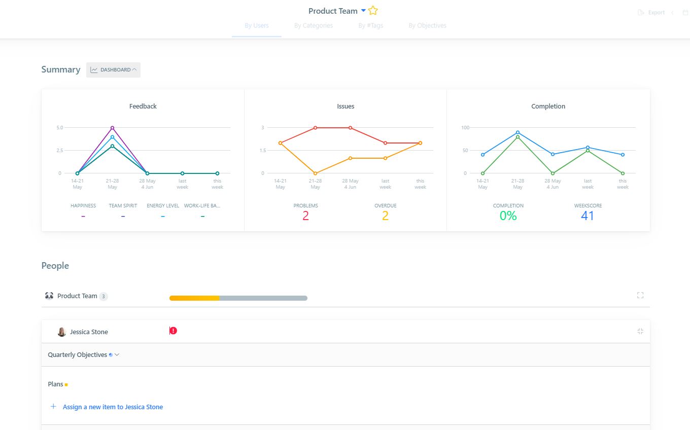
Our new weekly reporting form limits the usage of highly saturated colors, reducing the amount of stress to our users. It also brings more attention to notifications and problems as they are not competing with as many high intensity colors. Now when we do use aposematic colors for notifications or problems, attention is obtained without overwhelming the user.
Normative Aesthetics:
In our semiotics crash course we discussed the concept of codes and how they can be biologically ingrained or culturally learned. One example of a code to consider is actually aesthetics! We have a variety of aesthetics codes that we are both taught through culture as well as through biology as well.
Think of how seeing a cute puppy or kitten triggers an almost universal cute response, but a piece of modern art may only trigger positive responses for some people. The field of normative aesthetics examines what aesthetic appreciation we share across cultures and which are limited to certain cultures or groups.
What it means for design:
Knowledge of normative aesthetics could help you create a widely loved design, or create a custom design for a specific segment or cultural group. In looking at normative aesthetics in design we examined the perception of rectangles and their signified meanings across cultures.
If you are wondering why rectangles, just look at your screen and count the number or rectangles you see! In the research we first had users create rectangles based on a design task “create a cute rectangle”, later we conducted a second phase of research where we asked participants to complete a series of likert scales describing the traits they associated with the rectangles.
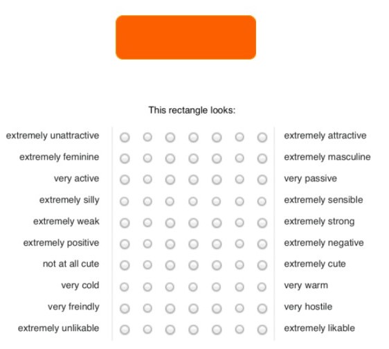
So much can go into a simple shape and color for a call to action. For cuteness, it was clear that light colors with rounded shapes are the better rectangle. We also found that an individuals degree of cultural self-construals (how independent or interdependent one finds themself) were tied to preference for rectangles.
How Weekdone applied it:
When it comes to applying this knowledge it is pretty easy. Where else do we have to worry about colorful rounded rectangles? CTA buttons! When it came to front-end landing page design this research was easy to put into practice. We were able to take the results of this research and apply it to the buttons of our own landing page. To better draw attention and generate feelings to match the intended CTA. Being aware of both color and shape.
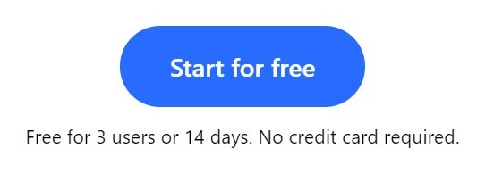
The switch to a more rounded button serves our brand messaging, with the goal to be more inviting. The saturated orange created a sense of urgency for sure (using that concept of aposematism we mentioned), but did not create the welcoming and approachable feeling we were looking for.
Wrap up:
Hopefully you now have your interest peaked in semiotics and already have some ideas on how to incorporate the basics of semiotics into design and UX. I will be working on new materials for how to apply semiotics in all aspects of your business from marketing and customer research to leadership and HR.
If you want to see a good example of semiotics in action you can also check out Weekdone. Weekdone gives you everything you need as a manager to leader and guide your team in the right direction. Try for free with your team for 14 days.